CloudContactAI Branding
Version 1.0, 2023
There are multiple facets of a logo to consider with how it is applied to a company’s appearance. It is important to choose deliberately shape, size, color, and placement of a logo.
The Official Face
A company or application brand logo must be utilitarian. At a moment’s glance, it should be a strong indicator of what the company trades or an application’s functionality. Take for example our own logo. It is an artistic rendition of a cloud where each “orb” is a speech bubble, showing the application’s construction and the fact it is a multimedia marketing platform. It is also simple in design and utilizes colors that are not grating or contradictory.
This logo is plastered all over everything we do. This will be seen on:
-
- Our Marketing
- Application Registration
- Advertising
- Events
Color Logo Primary Logo

Color White Primary Logo
Use of Spacing
Empty spacing might be uncomfortable to look at, but so is the lack of spacing between visual elements.
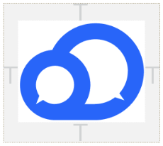
Clear space
The clear space area is the height and width of the ‘T’ in the logotype, as illustrated opposite. The outer box in the diagram indicates the area in which no other graphic elements or text should appear. This also indicates the closest the logo can appear to the edge of a given format.
Minimum size
It is essential that the brand logo is clear when used at small sizes.
For print
The logo should never be used below 25mm.
For digital / on-screen
The brand logo should never be used below 150px.
Small-size brand logo
To ensure that the logo is legible in small sizes, on items such as branded merchandise, a small-size logo is available.This logo should only be used below the following sizes:
50px for digital or 13.229mm for print.
How Not to Use a Logo
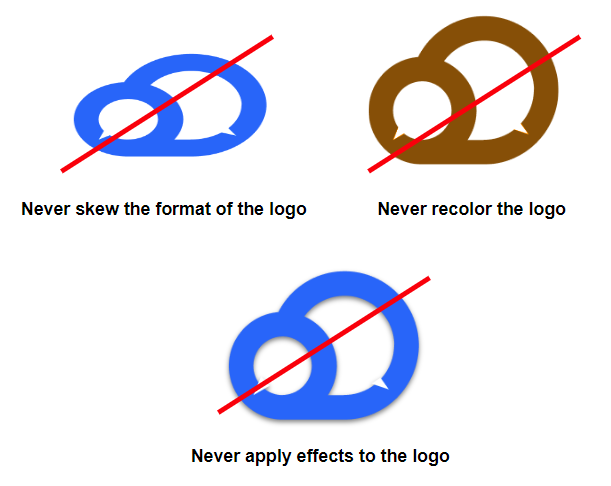
It’s important to keep the visual appearance of the logo consistent, and potential customers will immediately take issue if the logo looks like what it shouldn’t. It’s important it isn’t altered or changed in any way from the examples shown on the previous pages.
Even something as harmless as a recolor should be avoided if it will not be applied to all instances of that logo across websites, promotional material, and any applications it’s used on.
Darkness and Brightness
Colors should not sharply clash with each other, but neither should they blend either. There will be instances where a logo must be placed on a dark or bright background. Ideally, as provided earlier in this guide, there will be two versions of the company logo ready for either situation. Even when both versions of the logo are different colors, they should still use similar colors to each other.


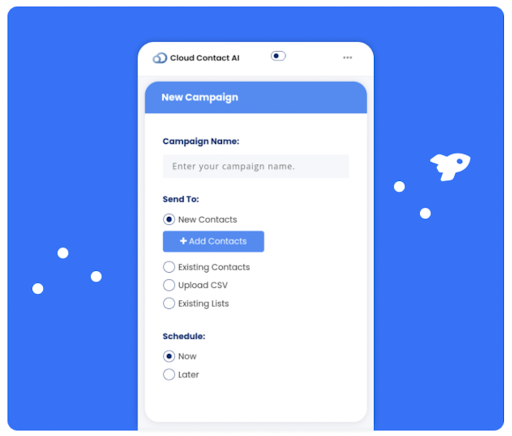
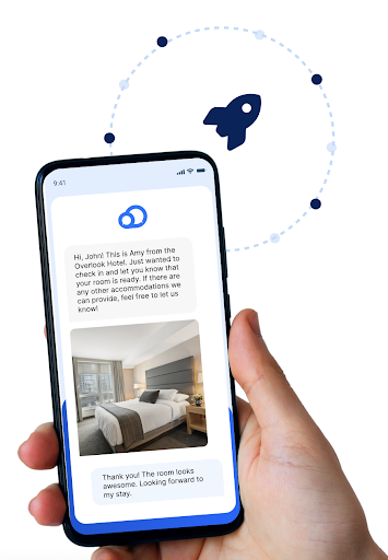
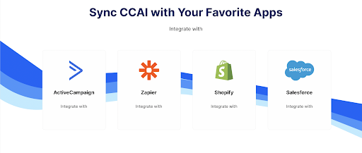
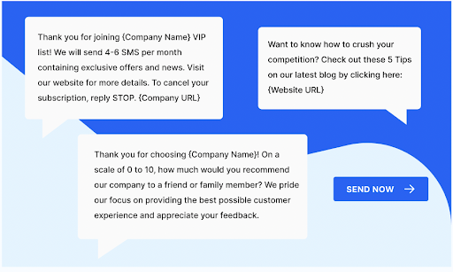
This also applies to any other graphical elements incorporated with the logo. Background aesthetic designs and other objects should abide by the same color pallet and art style for the sake of consistency. As such, in a lot of our media, there will either be waves in the background or rocketships that bear all of the mentioned color attributes displayed above.
Rockets Example

Wave Pattern Examples
Header and Titles
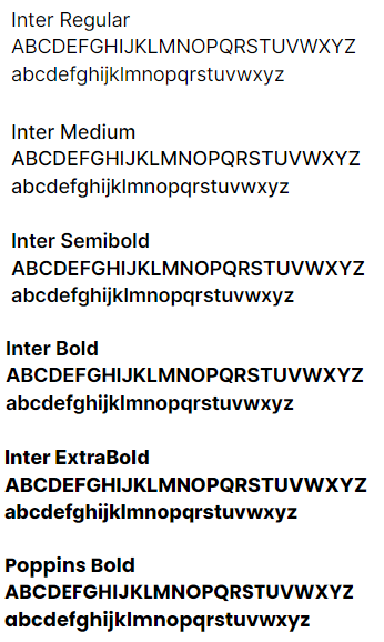
Finally, logos should be treated with the right headers. Fonts and the degree of boldness will need to be adjusted, but consistent between their uses.
Inter is used for headers, promotional materials, subheaders on articles, and body copies.
Poppins is used exclusively for Headers in marketing banners.
